Invisible Cities: Elise Swopes

Invisible Cities: Elise Swopes

Above: “data privacy” by stockcatalog licensed under CC BY-SA 2.0

Invisible Cities: Elise Swopes

3 years ago

As one of the original Instagram artists, Elise Swopes learned to connect with a worldwide audience of millions by melding art with a message. Since then, the Brooklyn-based photographer has worked on countless ideas showcasing her surreal cityscapes and streetwise style.

Perspective
Edition 1 of 1
It’s all in the mind.

Describe the cities in your art:

Chicago has been my favorite playground for over a decade. I moved to New York in March 2020 and it’s been a lot of fun playing in a new territory. 

How did you become interested in using cities as the subject of your art? Which aspects of cities fascinate you the most?

Architecture flows through color, lines, and shapes. Architecture looks different in certain light and weather. Architecture is free and available to explore. So, it’s difficult not to use it as my subject when I began as a college dropout with no money. Taking photos of people has stressed me out a bit, though because I’ve had to boost someone’s self-esteem so they can perform confidently but the cities always perform. They’re always confident.

What do cities mean for you?

Cities feel limitless. Every corner is new on any given day. From down below to high up, I’m intrigued.

In the Eye of the Storm
Edition 1 of 1
To achieve stillness even at the center of a difficult situation or “eye” of a storm.

Which are your favorite cities? How do these cities inspire you and influence your art?

Chicago, New York, and Tokyo. Tokyo changed me as a person. The way people respect one another and show kindness is so special.

What are you trying to express through depiction of cities? In portraying cities, what are the (bigger or personal) stories you’re trying to tell?

Cities are the canvas to my soul. They give me an opportunity to dream and add a little bit of me to every photograph I take.

What’s your approach to make art about cities (creative process, technique, art genre, aesthetics etc.) 

I love taking helicopter flights around a new city. I think it’s one of the most unique perspectives you could possibly have. I take photos with my iPhone mostly but I also use a Canon R5. I also edit everything on my iPhone within a couple different apps that I’ve been pushing to the limit for almost a decade. I believe I’m painting surrealist scenes with my fingertips.

Where Focus Goes, Energy Flows
Edition 1 of 1
When Mother Nature and architecture fuse together, we are presented with a fine line between utopia and dystopia. I’ve walked this fine line by creating a surrealist combination of cityscape and waterfalls using only an iPhone as my tool of choice.

What does your ideal city look like?

My ideal city has a good mix between natural occurrences like waterfalls, forests, or mountains mixed with manmade concrete and glass. In respect to Mother Nature, of course.

What’s the relationship between people and cities (or nature and cities) in your art?

Some may see some of my art as destructive, but I like to imagine it as a regular day. Although subconsciously, there’s a lot to be said about human’s lack of care of the Earth and personal responsibility.

What are the little things you want your viewers to notice in your art?

How important iPhone art is to younger people who don’t have expensive equipment or programs. I’ve been working diligently for over a decade even when it wasn’t popular to make sure I stayed on the map. It wasn’t easy and I was tested plenty of times to give up. But I persevered and will continue to.

What’s your dream art project to do?

To produce a curriculum for high schools around the world for iPhone photography and editing.

28

SuperRare

SuperRare is a marketplace to collect and trade unique, single-edition digital artworks.

Art

Tech

Curators' Choice

Invisible Cities: Fabio Giampietro

Invisible Cities: Fabio Giampietro

The interview is conducted as part of the SuperRare April Exhibition: Invisible Cities, curated

Invisible Cities: Fabio Giampietro

3 years ago

Fabio Giampietro was born in Milan, Italy, he is still alive.

Through his seminal painting technique of subtracting the color from the canvas, he realizes powerful and intense figurative paintings.

In Fabio Giampietro’s work the barriers of art come tumbling down and the propensity of continuity and simultaneity amongst the three spatial dimensions and time becomes tangible, though still imponderable to the viewer’s eyes. His work marks the liberation of painted forms from the classical framework, enhancing a process already well established in the course of Italian Modern and Contemporary Art. It started with the revolutionary theories of Futurism at the beginning of the XIX Century and continued with the velocity of Lucio Fontana’s gesture of cutting the canvas to explore the space behind and beyond it.

Giampietro’s investigations melt the tradition of painting with the most innovative technologies conjugating the planes of space and time and annihilating the contemplative distance between the senses of the spectator and the reality of the art work. The virtual dilatation of the painting invites the spectator to experience its reality within its newly exploded boundaries, calling on all the possible resources of psycho-sensorial experience. His main achievement lies in the fact that he shows that the painted work on canvas no longer has a central core, even though it exists and faces us. Rather, it presents a dissemination of observing points linked to the spectator’s physical movements inside the virtual coordinates of the space arranged for us by the creative mind of the artist. For this reason, every step inside Giampietro’s work also guides our voyage inside of the nightmares and the dreams of the artist’s mind, more vividly and presently than ever.

Коломна
Edition 1 of 1
A portrait. In the Metromorphosis series the boundaries between portraits and urban landscapes collapse into a play of lights and shadows. Oil on canvas, 2020. 8712 x 9018 pixels

Describe the cities in your art:

Cities in my art are inspired by the image of the “megalopolis”, the continuous, uniform city that is covering the world swallowing the nature between one city and the others. if it were to be one of the Invisible Cities in Calvino’s book, it would be Cecilia or Leonia.

How did you become interested in using cities as the subject of your art? Which aspects of cities fascinate you the most?

My artistic journey started studying Coney Island, the first Luna Park in history. Lot of social and technological experiments took place in that magic territory and it was the genesis of a new urban experimentation, a new way of looking at architecture that led to the verticalization of the cities. It was a radical change in conceiving the city, so very well described in Delirious New York by Rem Koolhaas. If at that time New York was a unicorn, an extraordinary case, a laboratory of artificial, technological and futuristic research, nowadays the town planning concerns a bigger number of cities, where the border between artifact, reality and nature seems to be vanished. I look at the cities like human artifacts, geological signs and prints humans are leaving on the planet, I am fascinated by the shapes of the metropolitan areas looked from far above in space. The similarities in how we are terramorphing and shaping our planet and the ways all the other life forms colonize their space are stunning. 

Drunken City Vertigo
Edition 1 of 1
Drunken City is the second NFT from the Vertigo series. It has also a VR version. Vertigo is a series of paintings depicting urban landscape seen from a dizzying height. The vertigo inducing perspective is presented as a monochromatic, often sepia-toned, image with the brilliantly composed lines of the surrounding architecture centering in on a comparatively small patch of concrete ground. In this manner, the images give the sense of free falling. Oil on canvas

What do cities mean for you?

Cities have always been the places to be for evolution, innovation, culture and art, they stand like open air museums of the history of past civilizations. Well this was until the web, the decentralization and the pandemic.

Which are your favorite cities? How do these cities inspire you and influence your art?

NYC is the main inspiration in my work, the first vertical city made of concrete, the Icon of a city. Many of the New York skylines are shared and consensual figures. Images of a certain place that people acquire and keep, either because they are borrowed from novels or movies. They are therefore cultural representations and mnestic figures at the same time. The communicated image of the skyline that carries power is generated by the buildings themselves that have an undeniable power on the formation of the Icon.

I am also inspired by the speed of the new asian megalopolis and by the babylonic attitude of the Emirates that transformed fisher villages in metropolis in a human lifespan.

The Downward
Edition 1 of 1
The Downward is a painting part of the Hyperplanes of Simultaneity series. This series achieved the Lumen Prize Gold Award in 2016. The virtual dilatation of the painting invites the spectator to experience its reality within its newly exploded boundaries in VR, calling on all the possible resources of the psycho-sensorial experience. Oil on Canvas. Physical size 117″ x 39″

What are you trying to express through depiction of cities? In portraying cities, what are the (bigger or personal) stories you’re trying to tell?

I use cities, buildings and skyscrapers as pieces of a puzzle, they have become my alphabet that I use to tell stories. In the metromorphosis series landscapes are transformed into portraits. In my works nature is often absent but I painted the forces of nature in the form of tornadoes, tsunamis and earthquakes, all composed of buildings to underline the direct link between human action and its consequences on nature.

What’s your approach to make art about cities (creative process, technique, art genre, aesthetics etc.) 

After years of research in city painting I ended up creating my own painting technique to speed up and refine the process, I called it oil on canvas subtraction. You can watch it in this video here because as always it’s easier to see than to describe. I try to induce in the viewer dizziness and vertigo. I want the viewer to be surprised and totally immersed in my canvases which are often quite huge. My exhibitions often combine a playful side with something unsettling that generates awareness of the issues that are the theme of the work. This led me to approach digital technology, I wanted more and more interaction between my works and the public and when 6 years ago consumer VR came on the market I immediately adopted it and I began to create immersive paintings in which the viewer had an active part by actually entering the picture.I found that the mix of the real painting standing like a portal and VR is a very effective recipe for vertigo!

What does your ideal city look like?

My ideal city is made up of small interconnected parts like cells of a larger organism, like tiny worlds with a green and wild park in the center as a core surrounded by different areas dedicated to culture, commerce, finance and education with a small residential area within each of these. In this way every citizen has to cross the wild to reach each area during his daily routine meeting other people, doing activities and being aware of preserving nature.

It definitely looks nothing like dystopian worlds like the ones I paint which are more warnings about where we are going and what will remain of us.

Victorian Vertigo
Edition 1 of 1
Vertigo is a series of paintings depicting urban landscape seen from a dizzying height. The vertigo inducing perspective is presented as a monochromatic, often sepia-toned, image with the brilliantly composed lines of the surrounding architecture centering in on a comparatively small patch of concrete ground. In this manner, the images give the sense of free falling.

What’s the relationship between people and cities (or nature and cities) in your art?

In my art there are often no people. Cities that stand like fossils, frozen in time like huge statues witnessing human civilization, sometimes nature appears reclaiming its spaces to testify how ephemeral we are in the time of the universe.

What are the little things you want your viewers to notice in your art?

Definitely the handmade details. God loves details! In the portraits series for example there are a lot of hidden details, easter eggs that are references to the subject life. In ‘Oldboy’, the piece I selected for the exhibition there are for example hidden rifles and guns, a complete red light district with liquor stores and Strip Clubs, the college where John was a teacher and others.

Old Boy
Edition 1 of 1
A portrait. In the Metromorphosis series the boundaries between portraits and urban landscapes collapse into a play of lights and shadows. Oil on canvas, 2020. 6482 x 6410 pixels. Physical canvas size 68″ x 67

What’s your dream art project to do?

I have a dream, a decentralized real life exhibition taking place simultaneously in different cities, I want to paint a lotus flower shaped city inspired by the Lotus Temple in Delhi, that is, a temple where anyone can practice their religion. In each of the cities I want to exhibit a single petal-shaped work, through VR visitors will be able to enter the painting and see the whole flower and also the other visitors of the other exhibitions and they will be able to communicate to each other through a specific sound language that I am developing. It only remains for me to study a way to be present at all the openings for the vernissage drink!

28

SuperRare

SuperRare is a marketplace to collect and trade unique, single-edition digital artworks.

Art

Tech

Curators' Choice

Invisible Cities: Annibale Siconolfi

Invisible Cities: Annibale Siconolfi

The interview is conducted as part of the SuperRare April Exhibition: Invisible Cities, curated

Invisible Cities: Annibale Siconolfi

3 years ago

Annibale Siconolfi is an artist, architect and sound designer from Italy. His art is characterized by a complex 3D modeling of futuristic cities and landscapes. Annibale has experimented and studied different 3D techniques with the aim of giving life to his visions characterized by endless urban scenarios, coexistence between nature and technology and new types of habitat. His work has appeared on some of the biggest online art and architecture platforms and exhibited in France, Russia and Italy.

Re-Cities
Edition 1 of 1
What will the cities of the future be like? RE-CITIES is one of the megacities of the future that I imagined. Modeled entirely in 3d, this work tells us about a future civilization forced to a vertical expansion due to total saturation of the building land.

A. Describe the cities in your art

Futuristic, mysterious, eternal. The cities of future are the main subject of my art. My vision of these cities is influenced by the work of architecture masters like Le Corbusier, Louis Kahn, Antonio Sant’Elia but also from writers like Philip K Dick, Isaac Asimov, Italo Calvino. Since i was a child i experimented with different fields of art, from sound design to architecture, and i think all these elements now converge in my artworks.

B. How did you become interested in using cities as the subject of your art? Which aspects of cities fascinate you the most?

I’m an architect so it was natural for me to start experimenting with cities models.

The thing that fascinate me mostly is the complexity of the cities. I like to analyze how the urban fabric has evolved from the begin to the actual status, and how it could be in the future. 

Memories of a lost world
Edition 1 of 1
“I remember… those people, their way of living and those enchanted places.”

C. What do cities mean for you?

They represents the greater expression of the human sociality. Every city is like a complex organism to study and humans are their lifeblood.

D. Which are your favorite cities? How do these cities inspire you and influence your art?

Honestly i think there are so many beautiful cities, i don’t have a favorite one. One of the city which inspired me lately was Naples, i’m fascinated by its dense urban fabric, the overpopulated areas and so many influences of different cultures. Also i like by the contrast between the urban agglomerations and the “empty” of the sea. 

Breathe
Edition 1 of 1
TAKE A DEEP BREATH AND LOOK TO THE FUTURE / 4000x2500px

E. What are you trying to express through depiction of cities? In portraying cities, what are the (bigger or personal) stories you’re trying to tell?

I want to represent my dystopian / utopian vision of the cities of future. I try to relate to the extreme consequences of some problems that afflict the world today, such as global warming, overpopulation, pollution, epidemics. But it is not always so obvious. In other works, I like to create more pleasant cities and landscapes of the future, in which the observer can get lost pleasantly for a few minutes. But generally i prefer that the viewers will have their own interpretation of my works. It’s nice to see how they inspires so many writers and directors to create stories around.

F. What’s your approach to make art about cities (creative process, technique, art genre, aesthetics etc.)

Generally i start from a vision i had in my mind, i try to realize it as much detailed as possible. I experiment a lot of not standard techniques with 3D softwares trying to represent it. if you have a precise idea to realize in your mind then you have to find the technique to create it and i think this is the funniest part of the creation.  

The Old Town
Edition 1 of 1
A glimpse of the old town, where the past meets the future.

G. What does your ideal city look like? Or, for artists who do futuristic cities: what’s your philosophy considering urban designs for a future city?

I think cities of future should have a better organization and more respect for the nature. I would like to see more parks / green areas and less traffic.  Also i see the ideal city of future as a city able to accomodate all the cultures of the world in a peaceful way.

H. What’s the relationship between people and cities (or nature and cities) in your art?

the relationship between nature and cities it’s one of the main themes of my work. Some of my artworks are characterized by extreme solutions for this difficult co-existence, like enormous O2 generators able to clean the air of the polluted areas or gardens built on the top of abandoned cities. I hope that these scenes will stir viewer’s conscience. i think we need to change our life style and find solutions to defeat the pollution problem, this is what our planet is asking us now.

Infinite Cities
Edition 1 of 1
“Cities, like dreams, are made of desires and fears, even if the thread of their discourse is secret, their rules are absurd, their perspectives deceitful, and everything conceals something else.” ― Italo Calvino, Invisible Cities

I. What are the little things you want your viewers to notice in your art?

i’m obsessed by little details, so i always hope that my viewers will spend some time to observe all of them.

J. What’s your dream art project to do?

i have so many dream art projects. one of them is to realize an explorable 3d city based on my artworks.

28

SuperRare

SuperRare is a marketplace to collect and trade unique, single-edition digital artworks.

Art

Tech

Curators' Choice

SuperRare Art Market Weekly Report

SuperRare Art Market Weekly Report

Cycle Waves

SuperRare Art Market Weekly Report

SuperRare

3 years ago

March 22-28

Weekly recap of the 10 highest digital art sales on SuperRare.

#10 Girl with a Pearl Earring – Reinterpretation by @grif was collected by @arlogo for $67,993

Girl with a Pearl Earring – Reinterpretation
Edition 1 of 1
Here in the re-imagining of ‘Girl with a Pearl Earring’ (Johannes Vermeer 1665), the flat oil painting becomes dimensionalized. We step through the looking glass and into the portrait, frozen in time. The camera explores a more intimate relationship with our subject, investigating the details of the cracking paint and subtle light across her face. The form of the girl becomes appended with a blooming floral arrangement, representing the passing of time with something that is timeless, nature. Part of the Equinox Collection

#9 Going Green by @grif was collected by @artoninternet for $76,761

Going Green
Edition 1 of 1
An abandoned classic Porsche 911 in the desert is overtaken by a wave of energy, re imagining the steel shell as a fertile garden. Part of the Equinox Collection

#8 Humano, racional by @frenetikvoid was collected by @perceptive for $83,992

Humano, racional
Edition 1 of 1
Destiny?

#7 Is God Dead? by TIME was collected by @mondoir1 for $109,848

TIME Is God Dead?
Edition 1 of 1
TIME Magazine, April 8th, 1966. Is _ Dead? is one of the most iconic cover designs in TIME’s 98-year history. Originally published on April 8, 1966, “Is God Dead?” was the first cover in the brand’s storied history to include only typography with no image and was designed for a story by TIME religion editor John Elson. As Elson wrote, “it is a question that tantalizes both believers, who perhaps secretly fear that he is, and atheists, who possibly suspect the answer is no.” The cover inspired countless angry sermons, 3,421 letters from readers and a lively debate at a time when 97% of Americans told pollsters they believed in God. This NFT is part of an exclusive series of three incredibly prescient TIME covers, including one of the most iconic covers in TIME’s 98-year history, and the first-ever cover designed exclusively as a NFT. The typography used on the 1966 cover was based on Bodoni Poster, designed by Chauncey H. Griffith in 1929. The bold contrasting strokes, strong verticality and easily recognizable serifs and ball terminals were perfectly suited for advertisements, posters and signs in the early 20th century. The typography on the two most recent covers needed to be hand drawn, as we could find no modern type foundry which has an exact interpretation of the one used on the original cover.

#6 Cycle Waves by @reisingerandres & @skygolpe was collected by @33nft for $116,931

Cycle Waves
Edition 1 of 1
The first collaboration and creative union of the artists Skygolpe & Reisinger Andres. Cycle Waves are without any doubt a key element used to represent reality in its complexity, allowing us to find similar patterns repeating through time that can help us to imagine a more rational understanding of nature. This piece can be interpreted as a mirror.

#5 Never Forget by @mbsjq was collected by @arlogo for $120,899

Never Forget
Edition 1 of 1
“The stupid neither forgive nor forget; the naive forgive and forget; the wise forgive but do not forget.” Astro & The Universe. 1/1, Single Edition.

#4 Loading New Conflict… Redux 5 by @xcopy was collected by @dcinvestor for $125,003

Loading New Conflict… Redux 5
Edition 1 of 1
Please stand by. Generating pretext… Redux 5 of 6

#3 YIN YANG// by @fvckrender was collected by @arlogo for $128,651

YIN YANG//
Edition 1 of 1
The forces

#2 Is Fiat Dead? by TIME was collected by @mondoir1 for $130,248

TIME Is Fiat Dead?
Edition 1 of 1
TIME Magazine, Special NFT Edition, March 29th / April 5th, 2021. Is _ Dead? is one of the most iconic cover designs in TIME’s 98-year history. Originally published on April 8, 1966, “Is God Dead?” was the first cover in the brand’s storied history to include only typography with no image and was designed for a story by TIME religion editor John Elson. More than a half century later, in response to President Donald Trump and the truth, TIME’s April 3, 2017 cover asked “Is Truth Dead?” Four years later, amid the stratospheric rise of NFTs and adoption of cryptocurrencies, TIME returns to the stark black field and red bold typography to once again ask a provocative question, “Is Fiat Dead? Inspired by the moment, TIME’s Creative Director D.W. Pine notes: “The word ‘fiat’ isn’t necessarily a commonly used phrase in American culture. Truth be told, I had to look it up. But it affects every global citizen. And I love the idea that it’s meaning isn’t clear to the casual viewer – much like the crazy, lucrative world of NFTs.” This is an exclusive series of three incredibly prescient TIME covers, including one of the most iconic covers in TIME’s 98-year history, and the first-ever cover designed exclusively as a NFT. The typography used on the 1966 cover was based on Bodoni Poster, designed by Chauncey H. Griffith in 1929. The bold contrasting strokes, strong verticality and easily recognizable serifs and ball terminals were perfectly suited for advertisements, posters and signs in the early 20th century. The typography on the two most recent covers needed to be hand drawn, as we could find no modern type foundry which has an exact interpretation of the one used on the original cover.

#1 Is Truth Dead? by TIME was collected by @mondoir1 for $138,094

TIME Is Truth Dead?
Edition 1 of 1
TIME Magazine, April 3rd, 2017. Is _ Dead? is one of the most iconic cover designs in TIME’s 98-year history. Originally published on April 8, 1966, “Is God Dead?” was the first cover in the brand’s storied history to include only typography with no image and was designed for a story by TIME religion editor John Elson. More than a half century later, in response to President Donald Trump and the truth, TIME’s April 3, 2017 cover asked “Is Truth Dead?” At the time, editor Nancy Gibbs wrote: “just like many said they believed in God in 1966, many today would say they believe in Truth, and yet we find ourselves having an intense debate over its role and power in the face of a President who treats it like a toy. What does he actually believe? Does it count as lying if he believes what he says?” This is an exclusive series of three incredibly prescient TIME covers, including one of the most iconic covers in TIME’s 98-year history, and the first-ever cover designed exclusively as a NFT. The typography used on the 1966 cover was based on Bodoni Poster, designed by Chauncey H. Griffith in 1929. The bold contrasting strokes, strong verticality and easily recognizable serifs and ball terminals were perfectly suited for advertisements, posters and signs in the early 20th century. The typography on the two most recent covers needed to be hand drawn, as we could find no modern type foundry which has an exact interpretation of the one used on the original cover.


28

SuperRare

SuperRare is a marketplace to collect and trade unique, single-edition digital artworks.

Shepard Fairey: Exploring incarnations of power

Shepard Fairey: Exploring incarnations of power

By Vinciane Jones, Verisart

Shepard Fairey: Exploring incarnations of power

3 years ago

Shepard Fairey is an internationally acclaimed artist. He initially gained notoriety with his “Andre the Giant has a Posse” sticker that transformed into the OBEY GIANT art campaign and changed the way people see art and the urban landscape. In 2008, he achieved worldwide recognition with the Hope poster he created of Barack Obama. Today, his stickers, guerrilla street art presence and public murals and recognized globally. Fairey’s works are in the permanent collections MoMA, the Museum of Fine Arts Boston, the San Francisco Museum of Modern Art, the Smithsonian’s National Portrait Gallery, the Victoria and Albert Museum, and many others. The artist has painted more than 105 large-scale murals across five continents worldwide, most recently in Dubai for his first solo show in the Middle East.

Shepard Fairey has created his inaugural NFT work, minted on March 29 in exclusive partnership with Verisart and SuperRare as part of 10×10: 10 inaugural NFTs by 10 major contemporary artists over 10 weeks. Bidding is open on SuperRare until 1pm EDT April 1.

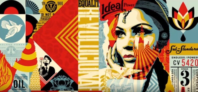
Shepard Fairey, Obey Ideal Power Mural, NFT

Incarnations of Power

Fairey’s inaugural NFT is an evolution of a mural the artist created in the physical world for a 2017 show at Library Street Collective called “Damaged”. The work is an exploration of the various incarnations of power. The artist explains, “Art has power. I’m interested in using art to raise awareness for the important political and social issues of our time. Power has many forms and is embraced or feared depending on who that power benefits, who it oppresses, who it uplifts, and who wields it.”

Shepard Fairey, Peace Dove, courtesy of the artist.

Shepard Fairey explaining his inaugural NFT, courtesy of the artist and Verisart. An extended version of the video will be exclusively available to the owner of the NFT through the Verisart certificate.

Fairey continues, “The Obey Ideal Power mural explores different incarnations of power and asks the viewer to consider the negative impacts of certain forms of power and the social and environmental benefits of other forms of power. For me, ideal power does not destroy the environment or corrupt democracy, but uplifts the oppressed, expands equality, cultivates peace, honors truth, and works in harmony with nature. The Obey Ideal Power mural intends to provoke an honest analysis of power that should be reformed or regulated because of the damage it causes and encouragement to value the power that aligns with and perpetuates one’s ideals.”

Shepard Fairey, Dwindling Stocks, courtesy of the artist. 

Art as a force for good

Fairey also wants to ensure his art is a force for good in more ways than one. Along with raising awareness about political and social issues, the artist actively wants to spark change himself. Shepard Fairey will be personally donating a part of the proceeds from his first original NFT art drop to Amnesty International via Verisart’s Fair Trade Art certificate. 

Shepard Fairey, Corrupt Influence, courtesy of the artist.

Fairey explains, “In an attempt to manifest the ideals I champion in my art in the real world, I donate a portion of the proceeds from this work to Amnesty International to support their important human rights efforts. By using the Verisart Fair Trade art certificate, collectors will know what charitable cause the work supports.” 

Shepard Fairey’s NFT is certified with a Fair Trade Art Certificate from Verisart, an award-winning blockchain certification platform. Fair Trade Art is an initiative by Verisart designed to bring together artists and social impact organizations to do good. The certificate signals that funds from the sale of the artwork are benefiting a charitable cause. 

Designed to empower artists to tell the story of their work, the digital certificates include additional images, videos and documents. Shepard Fairey’s certificate includes an exclusive video of the artist speaking about his work, accessible only to the owner of the certificate. For collectors, Verisart’s patent-pending Certificates of Authenticity (COA) form an integral part of collecting NFTs. They provide confidence in the identity of the artist and the verified history of the artwork.

Shepard Fairey, Damaged, courtesy of the artist.

An artist and an activist

Over his career, Fairey has frequently used his work to explore social and political issues. His iconic “Hope” portrait of Barack Obama, became the emblem of the 44th president of the United States of America’s election campaign. In 2017, the artist created the “We The People” series in collaboration with Amplifier, a nonpartisan campaign dedicated to igniting a national dialogue about american identity and values through public art and story sharing. The images are freely downloadable from Amplifier’s website and were recognizable during the Women’s Marches and other rallies worldwide in defense of national and global social justice issues. 

Shepard Fairey, Target Exceptions Ruby, courtesy of the artist.

Fairey also uses his art to respond to current events. More recently, during the Covid-19 outbreak, the artist joined forces with Adobe to create downloadable works that celebrate the bravery of health care workers and volunteers on the front lines of the pandemic. Ultimately, what makes Shepard Fairey’s art so powerful is its strong visual appeal combined with the ability to provoke emotions and spark conversations about important issues in the world today.

About the artist

Shepard Fairey was born in Charleston, South Carolina. He received his Bachelor of Fine Arts in Illustration at the Rhode Island School of Design in Providence, Rhode Island. In 1989 he created the “Andre the Giant has a Posse” sticker that transformed into the OBEY GIANT art campaign. After more than 30 years, his work has evolved into an acclaimed body of art, including the 2008 “Hope” portrait of Barack Obama, found at the Smithsonian’s National Portrait Gallery.

His works are in the permanent collections of the Boston Institute of Contemporary Art, Museum of Modern Art (MoMA), the Museum of Fine Arts Boston, the San Francisco Museum of Modern Art, the Smithsonian’s National Portrait Gallery, the Victoria and Albert Museum, and many others.

Shepard Fairey in his studio, courtesy of the artist.

Bidding for Shepard Fairey’s NFT, Obey Ideal Power Mural closes at 1pm EDT on April 1.

Join Shepard Fairey on ART TALKS WITH VERISART to hear him discuss life, art and tech with Robert Norton, CEO and co-founder of Verisart. Tuesday, March 30 at 3pm ET/8pm BST on Clubhouse. 

28

SuperRare

SuperRare is a marketplace to collect and trade unique, single-edition digital artworks.

Art

Tech

Curators' Choice